[
view_new_releases |
view_fonts_by_categories |
view_fonts_by_designers |
view_fonts_by_appearance |
font_freezer
]
[
text_fonts |
headline_fonts |
graphic_fonts |
modular_fonts |
historic_fonts |
pictorial_fonts
]
[previous font]
[next font]
up to higher level directory

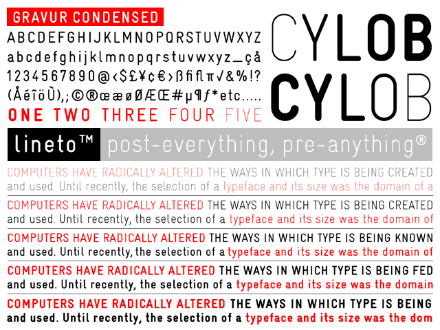
gravur condensed (5 weights)
(gravur condensed-thin, gravur condensed-light, gravur condensed-regular, gravur condensed-bold,gravur condensed-black)
designed by cornel windlin & gilles gavillet, 1996/2001
One of the key features of everyday life in switzerland is standardisation, ranging from the look of waste bags to the design of letterboxes. interestingly, and maybe perversely, 99% of all swiss letterboxes and door bells are inscribed in exactly the same way. there must be a whole army of name plate engravers all over the country, all using exactly the type style. i redraw the font together with gilles gavillet, generating 5 different weights (and an unpublished set of 5 alternate fonts).
